What are the two types of charts you are producing?I produce two charts. Both of which rely on the Johns Hopkins/WHO data that is uploaded to their Git repository on a daily basis. I update the charts with the data also on a daily basis.
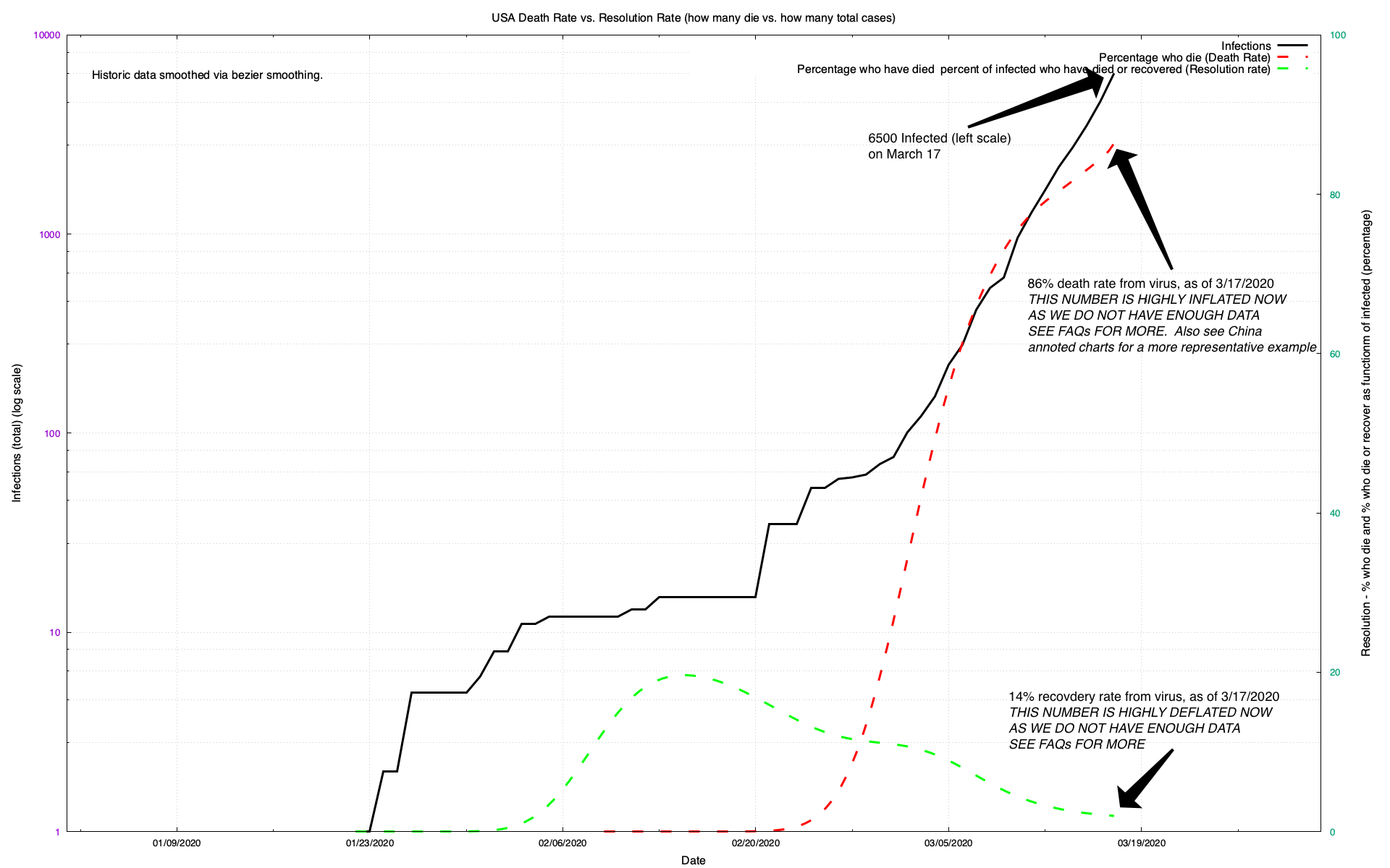
Base ChartsThe first type of chart is what I call a "Base" chart. It is simply the plot of three things in the data. One is just the total number of infected, as reported by the respective country. This number is highly variable on a country by country basis because countries differ in how they discover and report who is and who is not infected. For example, South Korea has a very aggressive testing schedule with opt-in drive-through testing. Though not perfect, this is probably the best way right now to derive an accurate assessment of who is and who is not infected in that country.
At the other end of the spectrum is the United States which, as of today (March 18th) has no comprehensive testing program in place. In other words, we just don't know how many in the US are infected and the infection numbers that the USA graph here presents should be taken with a grain of salt. They are certainly an order of magnitude (10x) or more (2x10x) less than actual.
The other two data points on the base charts are the "resolution" rate and the "death" rate. The resolution rate is calculated as that percentage of people who have either recovered (got better) or died from COVID-19 compared to the reported infections. The death rate is calculated as the percentage of people who have died from COVID compared to the number of people who have resolved (either got better or died). The death rate is simply the percentage of people who get the disease who then die from it. I do not base the death rate on the number of people who have been infected but rather on the number of people who have either gotten better or died. This is important.
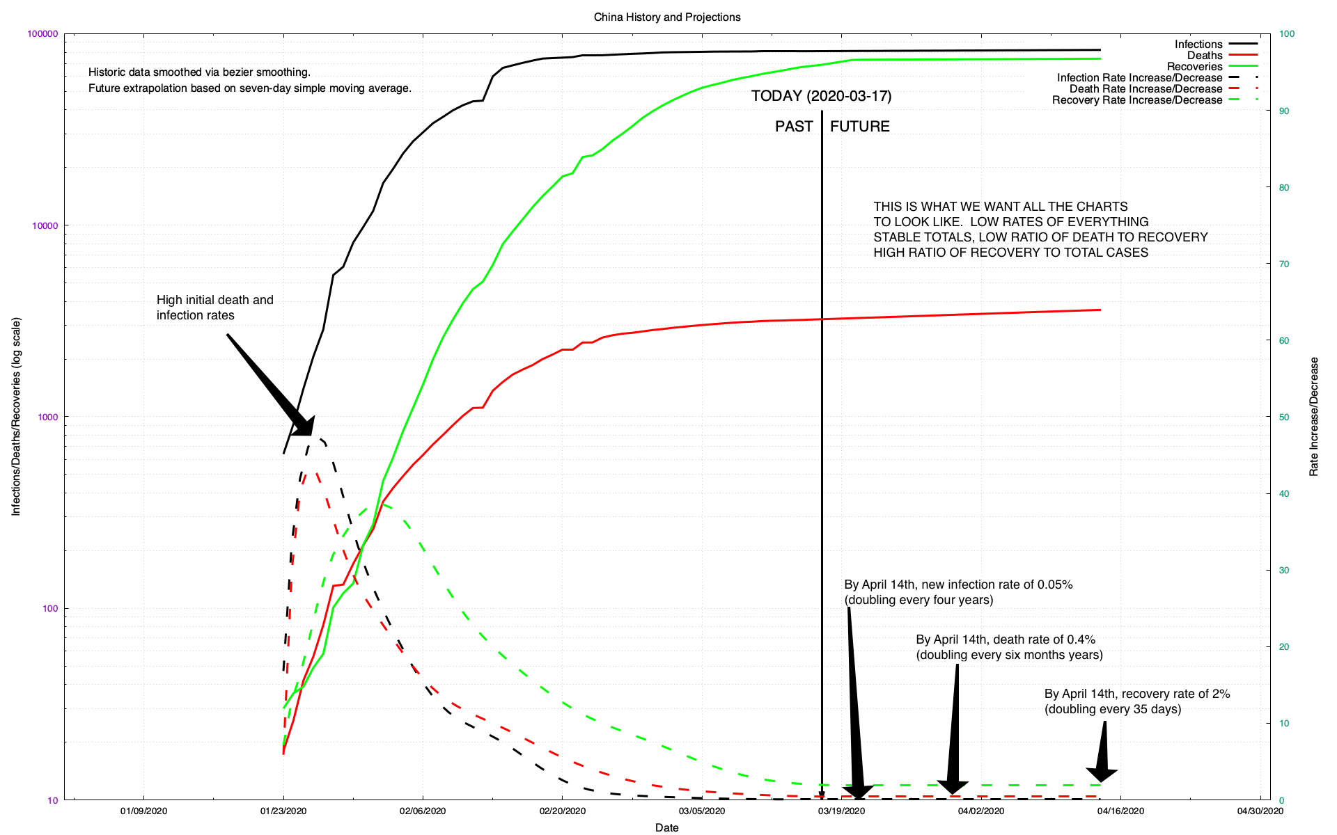
It is very important to note that while the number who have died is fairly accurate, the numbers infected and the numbers who got better are much more suspect. In general, both recoveries and infection totals are low. Moreover since you tend to die before you get better (if you get COVID-19), death rates early in an infection tend to be very high and then go down as the disease progresses. You see that clearly on the China base chart (see below).
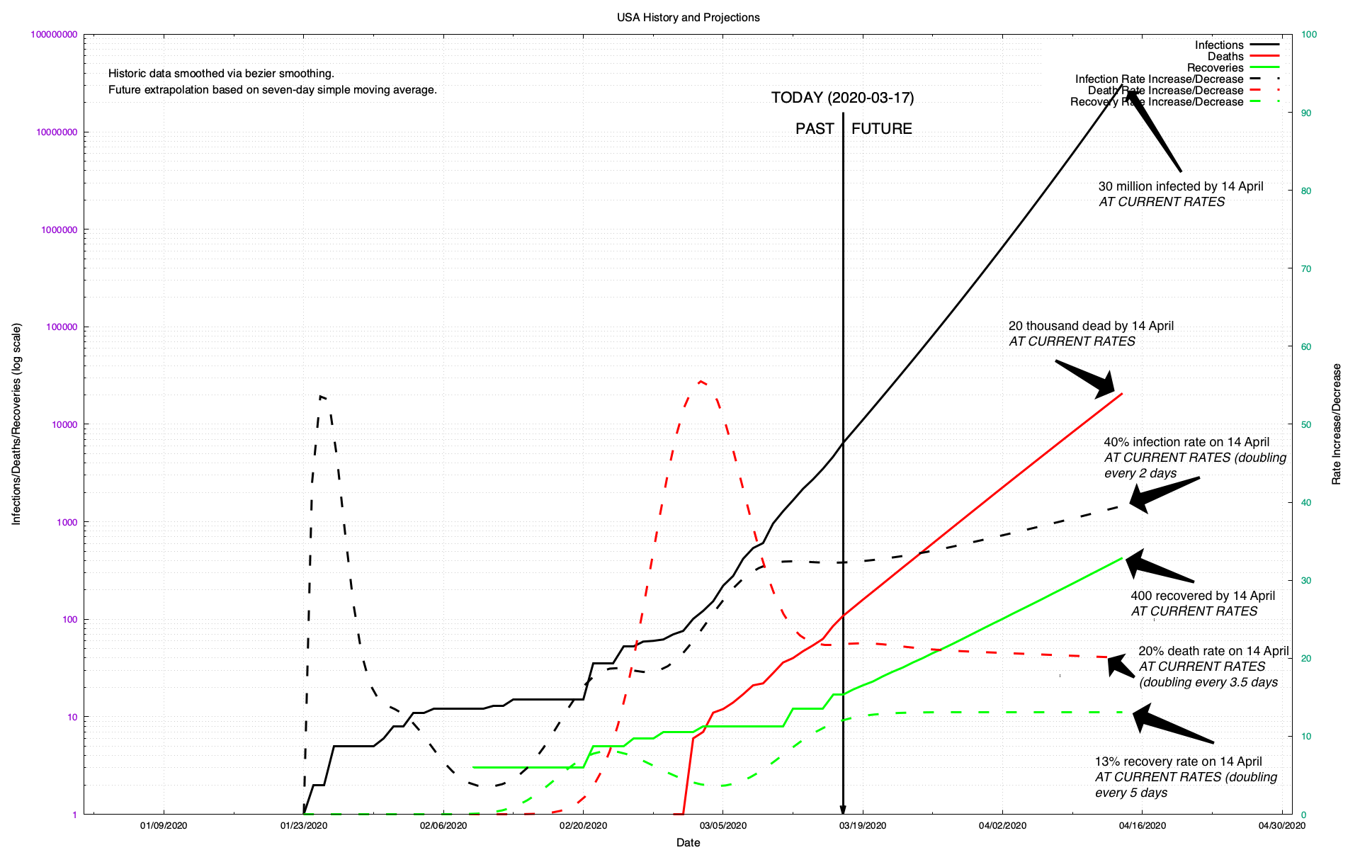
Projection ChartsThe other type of chart is what I call a "Projection" chart. It is a plot of the number of reported infected, recovered and dead. It is also a plot of the rate of change in each of those numbers. Finally, it contains both a "past" component and a "future" component. The past component is calculated directly from the reported data. The future component is computed based on a moving seven-day average from the past component. Currently I am projecting 28 days into the future.
Note that the rates in the Base chart (death rate, resolution rate) are very different from the rates in the Projection charts and should not be compared to one another. In particular, the rates in the Projection charts track day to day changes in the number of dead, infected, recovered.
What to look forAs you will see in the annotations that I have made to the representative charts (China and USA), what we are looking for is for the infection rates and numbers to "bend down." The media refers to this as "bending the curve" or "flattening the curve" (black lines on either chart).
This is clearly easy to see in the China charts. We cannot see it, yet, in the USA charts.
Here are some charts with annotations to help you understand how to interpret them:
What to keep in mind?Probably the most important thing to keep in mind, after the fact that the death rates are artificially high (especially early in a country's progression), is that the charts
do not represent the situation today.
Because of the amount of time that it takes:
- For symptoms to appear after infection (7-14 days)
- For people to die from the disease, if they are going to die (14 days)
- For people to get better from the disease, if they are going to get better (30+ days)
The charts depict not what is happening today, but what was happening between two weeks ago and a month ago. So, if you are looking at the projection charts, the arrow that depicts "TODAY" is what the data, today shows but what was actually happening two weeks to a month ago.
Here in the United States we are in the early few days of a complete shutdown. The effect of that shutdown (halting the virus) will begin immediately (that's what happened in China) but we will not see the effects until early April. Hopefully, if we're still around, these charts in the second week in April will show a sharp downturn in the number of infections/day here in the United States. Prior to that we can expect continuous upturns (especially as testing is accelerated) in the rate. Please do not let that alarm you. We need to start today so that we can benefit, tomorrow.